You’ll master transitional decor by anchoring your space in warm neutrals—creams, taupes, soft grays—then layering textures like linen, velvet, and wool to build visual depth without bold color risks. Apply the 70-20-10 rule: seventy percent neutral base, twenty percent secondary tones like charcoal or navy, ten percent accent color in small items. Choose one statement piece—a patinated brass mirror or abstract canvas—position it prominently, and echo its materials throughout. Thoughtful lighting in three layers completes the transformation from generic to personalized, with each principle working together to develop your space.
Start With a Neutral Foundation: Your Design Canvas

Every beautiful room you’ve admired probably started exactly here—with a whisper-soft wall color and understated flooring that doesn’t demand attention but commands respect. You’re building your design canvas with beige, warm gray, cream, taupe, or ivory—shades that bring calm into your space while welcoming layering textures like linen, velvet, and wool.
This neutral foundation isn’t boring; it’s strategic. By anchoring 70% of your scheme in these base tones, you create breathing room for deeper neutrals and accent pops that follow. Think brushed wood finishes and natural stone—timeless materials that ground your aesthetic without chasing trends.
You’re establishing consistent flow across adjacent rooms through matching neutral tones, allowing subtle shifts that prevent monotony. This approach shapes your home into a unified sanctuary where every room feels intentionally connected yet distinctly itself.
Understanding the 70-20-10 Color Rule

You’ll anchor your room with soft grays, warm beiges, or creamy whites—those calm, foundational tones that let everything else shine—before strategically layering in richer secondary colors like charcoal or navy to establish contrast. By reserving just 10% for accent colors in pillows, artwork, or small furnishings, you’re creating visual depth without clutter, letting texture and material quality become your design’s primary focus. This balanced approach transforms decorating from an overwhelming guessing game into a straightforward, achievable formula.
Building Your Neutral Foundation
The foundation of gradual design rests on a deceptively simple math problem: 70% neutral base, 20% deeper secondary tone, and 10% accent color—a formula that establishes restraint as sophistication. You’re building a calm canvas, not a blank wall.
Your neutral foundation relies on sophisticated taupes, beiges, creams, and ivories—think warm sand rather than sterile white. These colors create psychological calm while allowing textures and materials to become your design’s real focus. A linen sofa, woven jute rug, or marble side table reads visually richer than bold color ever could.
You’ll apply these neutrals across your largest surfaces: walls, primary furniture, and flooring. This 70% commitment establishes coherence throughout your space, grounding every future accent and deeper tone you’ll layer in. It’s restraint that feels deliberate and inviting—the backbone of transitional interiors executed with intention.
Layering Secondary and Accent Colors
How do you transform a serene neutral canvas into a room that conveys sophistication without demanding excessive attention? You’ll work with transitional colors by embracing the 70-20-10 rule—your framework for balanced, unified spaces.
- Anchor with 70% neutral palette (creams, beiges, warm grays) as your foundational base
- Introduce 20% secondary colors—charcoal, navy, taupe—creating depth through layering textures
- Reserve 10% accent color for art, pillows, vases—your room’s personality expression
- Apply accent color consistency across elements, reinforcing visual harmony throughout
Creating Visual Depth Through Balance
Transitional balance hinges on this principle: your 70% neutrals—think soft greige or warm ivory—establish calm, while your 20% secondary color introduces visual weight. That charcoal accent wall or navy velvet sofa anchors the eye, preventing monotony. Meanwhile, your 10% accent color—perhaps burnt orange through a single piece of art—adds interest without disorder.
Layering textures amplifies this effect. Combine linen, leather, and wool within your neutral foundation; depth cues emerge naturally through tactile variety rather than aggressive color shifts. This restraint creates sophistication. You’re building a sanctuary where every element belongs, where balance feels deliberate and calm, inviting you deeper into spaces that convey subtlety rather than loudness.
Choose Your Anchor Piece and Build From There

Every room needs a hero—a substantial piece that’ll anchor your space and communicate its character before you’ve added another thing. Your anchor piece—whether a sectional with clean lines or a warm wood dining table—establishes the entire room’s scale and tone, guiding every decision that follows.
Build balanced interiors by pairing your anchor with surrounding furniture that shares unifying elements: similar materials, proportions, or finishes that repeat throughout the space. This creates visual harmony without feeling forced or disconnected.
- Select an anchor that reflects your lifestyle and aesthetic vision
- Layer complementary textures around it using neutral supporting pieces
- Pair era-appropriate furniture that aligns in silhouette and proportion
- Maintain consistent scale to avoid overcrowding or mismatched masses
Your anchor becomes the reliable foundation—the confident choice that allows everything else to fall naturally into place.
Mix Furniture Eras Without Clashing

The approach to mixing furniture from different periods centers on creating a sophisticated conversation between them—one where a tufted sofa from the 1970s can comfortably share a room with a sleek glass coffee table from this decade. You’re building a transitional space with versatility by honoring scale and proportion across eras. Pair traditional silhouettes with contemporary finishes: imagine a classic wingback chair topped with brushed-metal legs. Maintain a cohesive color story—warm neutrals as your foundation, deeper tones anchoring 20%, and 10% accent color—preventing visual chaos. Use matching textures like linen and leather consistently. Vary your furniture heights deliberately: low-profile seating near tall cabinets creates rhythmic harmony. This restraint unifies everything, letting each piece breathe while belonging together.
Layer Textures in Similar Tones for Depth

You’ll discover that layering foundation textures—think a natural linen base paired with a chunky wool throw—creates understated sophistication without demanding bold color pivots. By introducing soft textures like velvet cushions or boucle accents within your existing taupe-to-gray palette, you’re building visual interest through tactile contrast alone, making your space feel composed with intention rather than randomly assembled. Strategic accent textures—a polished stone side table, brushed brass lamp, or tone-on-tone woven poufs—then complete the composition, adding depth that invites both the eye and the hand to linger.
Foundation Textures and Base
Layering textures in similar tones—think a creamy linen sofa paired with a charcoal velvet throw and a warm beige tweed rug—creates visual depth that flat, single-textured spaces simply can’t achieve. You’re building a foundation that communicates sophistication without demanding attention.
Start with these neutral textures as your anchor:
- Soft cotton or linen as your primary upholstery base
- Wool or boucle accents for tactile richness
- Matte and sheen finishes across metals and woods
- Tonal variations—lighter creams against deeper grays—for visual separation
This layered neutrals approach elevates ordinary rooms into welcoming sanctuaries. By prioritizing tactile depth over bold patterns, you’re creating spaces where your eye travels naturally, discovering new textural interest with each glance. The result? A unified, deliberate home that feels both refined and distinctly yours.
Soft Layering Techniques Applied
How do you transform a neutral room from merely calm into something with real presence? Through transitional layering—the art of combining textures that whisper rather than shout.
Start with your foundation: a smooth linen sofa in cream. Layer a chunky wool throw in oatmeal across its arm, then drape a velvet cushion in taupe nearby. Add a woven jute rug beneath, anchoring everything in cohesive warmth. This isn’t random; it’s strategic texture stacking within your neutral palette.
Mixed materials deepen the effect. Pair light oak side tables with brushed brass lamps and stone coasters—each element speaks the same tonal language while your fingers discover something different everywhere they land. You’re building depth through touch, not color. That’s where the sophistication lies.
Accent Textures for Visual Interest
What separates a serene room from one that genuinely interests is the deliberate play of surface contrasts—those quiet moments when your eye catches a shift from matte to luminous, from smooth to tactile. You’re building a texture hierarchy that whispers rather than shouts, using cohesive neutrals as your foundation.
Consider these transitional textures for visual interest:
- Tone-on-tone geometric rugs in linen or wool that ground your space subtly
- Variegated weaves on linen curtains catching light without demanding attention
- Polished brass or lacquered accents paired against matte wood surfaces
- Subtle patterned throw pillows in off-white or taupe with quiet prints
This tactile depth emerges naturally when you layer similar warmth across materials—linen with velvet, glass with soft chenille. You’re creating spaces where texture becomes your quiet language, inviting people to linger and belong.
Light Your Space Like a Designer

Why do designer rooms feel so inviting while our own spaces sometimes fall flat? Lighting is the key. You’ll master layered lighting by building three distinct layers: ambient, task, and accent. Think of ambient lighting as your foundation, task lighting as your problem-solver near reading chairs and dining areas, and accent lighting as your room’s jewelry.
| Layer | Purpose | Best Fixtures |
|---|---|---|
| Ambient | Overall illumination | Tiered chandeliers |
| Task | Functional brightness | Pendant lights |
| Accent | Visual drama | Sculptural pieces |
| Mood | Flexibility | Dimmers |
Choose warm metal finishes—brass, bronze—paired with textured bases like marble or wood. Your layered lighting strategy elevates ordinary spaces into designer-worthy rooms where you’ll want to spend time.
Add One Bold Element to Avoid Generic Spaces

You’ve built your neutral foundation—soft grays, warm woods, layered lighting—and yet something’s still missing, that indefinable quality that separates a well-designed room from a pleasant one. That essential ingredient? One intentional bold element that anchors your transitional decor and prevents blandness.
This focal point—a charcoal-framed abstract canvas or patinated brass mirror—needs rich texture, deep color, or metallic finish to feel purposeful rather than random. Here’s your roadmap:
- Select a single statement piece, not multiple competing focal points
- Position it where you see it immediately upon entry
- Echo its materials with surrounding furnishings for cohesion
- Maintain your cohesive palette while creating intentional contrast
That one fearless choice elevates your space from generic to distinctly yours—proof that restraint, when paired with conviction, creates rooms with character.
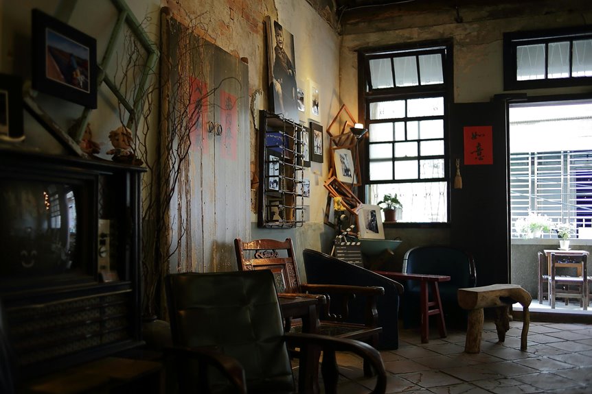
Real Transitional Spaces: Living Room, Kitchen, and Bedroom Examples

Now that your bold focal point anchors the room—preventing that dreaded beige blur—it’s time to see how this principle plays out across the spaces where life actually happens. In your living room, a streamlined sectional with warm wood accents becomes your foundation, layered with linen, velvet, and wool textures in neutrals that whisper rather than shout. Your kitchen marries shaker-style cabinets with quartz countertops and brushed nickel hardware, bridging traditional and contemporary with ease. Upstairs, your bedroom achieves Transitional calm through similar-toned textures—an upholstered headboard, crisp white bedding, a neutral wool rug—accented with restrained metallics. Throughout these spaces, three-layer lighting mixing brass and modern shapes connects the design together. This balanced approach to Transitional design creates rooms that feel deliberate, gathered, and distinctly yours.
Avoid These 5 Common Beginner Mistakes

How do strong design intentions unravel? You’re likely making one of these five mistakes that sabotage transitional style.
- Starting with bold, saturated colors instead of neutral foundations that let texture breathe
- Mixing eras without shared elements—mismatched scales that feel jarring, not sophisticated
- Anchoring spaces with heavy ornamentation that destroys restrained balance
- Skipping layering textures, relying solely on color for depth
- Ignoring lighting design’s three layers—ambient, task, accent—which flattens everything
You’ll recognize effective decor when you build foundations thoughtfully. A warm white wall supports layering textures: linen, wool, leather, pattern. Three light sources—overhead dimmer, desk lamp, accent uplighting—create dimension that makes your transitional space feel intentional, not accidental. You’re not just decorating; you’re composing visual harmony that welcomes people home.