
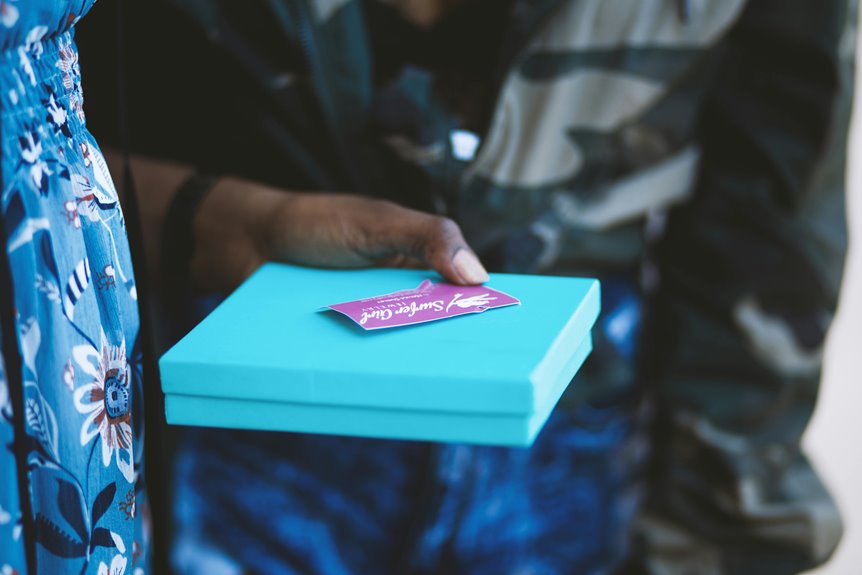
Standard gift cards measure 3.375 by 2.125 inches—credit card proportions that slip smoothly into wallets and align with decades of retail optimization. This size reduces production costs through established workflows, fits standard envelopes, and supports edge-to-edge designs that command attention. Whether you’re printing coffee shop vouchers or premium retailer cards, these dimensions balance visual impact with practical efficiency.
Understanding how bleed margins, safe zones, and custom shapes influence your design—and your budget—enhances a simple card into a memorable brand touchpoint.
What Are Standard Gift Card Dimensions?
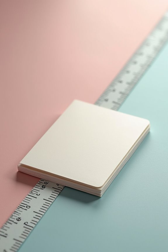
Ever wondered why gift cards slip so effortlessly into your wallet alongside your driver’s license and favorite credit cards? You’ve got the standard gift card dimensions to thank for that fit. The industry standard measures 3.375 inches in length by 2.125 inches in width — precisely matching credit card proportions — with a slim 0.03-inch thickness that won’t bulk up your wallet. This wallet compatibility isn’t accidental; it’s by design that makes your gift cards feel like trusted essentials rather than awkward add-ons. Whether you’re gifting a coffee shop card or high-end retailer voucher, this standardized size allows your present to slide easily into any pocket, envelope, or cardholder. You’re joining millions who appreciate the thoughtful engineering behind these proportioned tokens of generosity.
Why Card Size Impacts Your Bottom Line
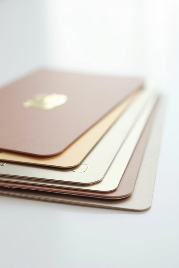
When you choose your gift card’s dimensions, you’re deciding how much you’ll spend on production, postage, and the visual real estate that’ll capture your recipient’s attention—three interconnected factors that’ll either work well together or drain your budget in unexpected ways. A standard 3.375 x 2.125 inch card fits snugly into wallets and standard envelopes, keeping your per-unit costs low, while larger formats like 5 x 7 inches demand premium printing, thicker envelopes, and higher postage rates that’ll noticeably impact your bottom line. Your design choices matter too: edge-to-edge colors and bold branding increase perceived value, yet they require careful attention to bleeds and safe margins—small details that prevent costly reprints and keep every card you produce in circulation.
Production Costs And Efficiency
Your choice of gift card dimensions isn’t merely aesthetic—it’s a financial decision that ripples through every stage of production, from the printing press to your customer’s wallet. When you select standard wallet-fit card sizes like 3.375×2.125 inches, you’re tapping into established production workflows that manufacturers have perfected. These conventional dimensions eliminate expensive die charges and reduce minimum run quantities significantly. Your card sizes directly impact ink consumption, coating application, and packaging efficiency—all factors that compress per-card labor costs substantially. By maintaining consistent measurements across your batch, you achieve economies of scale that custom alternatives simply can’t match. Standard wallet-fit cards also align seamlessly with envelope compatibility and fulfillment systems, protecting your bottom line at every touchpoint.
Mailing And Postage Expenses
Because postage rates hinge on weight and envelope dimensions, your gift card’s physical footprint directly determines how much you’ll spend getting it into customers’ hands. A standard 4×6 inch card—the industry standard—fits snugly into a #6 envelope, keeping your postage costs competitive and predictable. Bump up to 5×7 inches, and you’re suddenly investing in larger envelopes, heavier materials, and higher per-piece postage fees that compound across bulk mailings. Downsizing below standard dimensions? You’ll realize modest savings, though you risk alienating customers accustomed to traditional sizing. Smart businesses recognize that strategic sizing decisions directly impact profitability—every fraction of an inch matters when you’re shipping thousands of cards. Your envelope choice becomes your financial partner, working quietly to protect margins while delivering satisfaction.
Design Space And Branding Impact
A gift card’s dimensions aren’t just measurements—they’re your brand’s real estate, and how you use that space determines whether customers see a forgettable transaction or a keepsake they’ll carry in their wallet for months.
Standard sizes like 3.375 x 2.125 inches maximize your design impact while maintaining envelope compatibility. When you embrace edge-to-edge designs with bold brand colors, you’re transforming every surface into mobile advertising. Your logo wraps around corners; your signature hues create an immediate visual impact that reinforces recognition instantly.
The branding impact multiplies when consistency matches standard sizes across all touchpoints. That strategic color placement and prominent logo visibility don’t just look premium—they increase perceived value, encouraging actual redemption. Your wallet-sized card becomes an ambassador, subtly communicating your brand identity every time customers reach for their essentials.
Digital or Printed: Which Format for Your Needs?

When you’re choosing between printed and digital gift cards, you’re really deciding what works best for your customers’ lives—whether they’ll grab a wallet-sized card at checkout or pull up a 1024×768 pixel certificate on their phone. Physical cards demand portability and durability (think 5×7 inches slipping easily into a pocket), while digital options scale smoothly across screens, adapting from a small smartphone display to a full desktop without losing quality or impact. Your choice hinges on where your audience actually shops and how they prefer to carry their purchasing power.
Physical Dimensions and Portability
How do you want your gift card to exist in the world—tucked into a wallet, displayed on a shelf, or shared instantly through a screen?
Physical gift cards require thoughtful consideration of dimensions and portability. The standard credit-card format—3.375 by 2.125 inches—slides seamlessly into wallets alongside loyalty cards and IDs. Rounded corners improve portability, while sharper edges project sophistication. Larger formats like 4×6 or 5×7 inches command attention but sacrifice pocket-friendliness.
| Format | Dimensions | Best Use |
|---|---|---|
| Credit-Card | 3.375″ × 2.125″ | Wallet carry |
| Standard | 4″ × 6″ | Envelope mailing |
| Premium | 5″ × 7″ | Display & gifting |
Your choice shapes the recipient’s experience. Wallet-sized cards become constant companions—daily reminders of your generosity. Larger formats become keepsakes, physical artifacts that celebrate the occasion beyond monetary value.
Digital Scalability and Screen Optimization
Where does your gift card live—on a glowing screen or in someone’s hands? Digital gift cards require thoughtful optimization across devices. You’ll want responsive design that adapts seamlessly from iPhone 6 (375px width) to desktop monitors (1920x1080px), keeping your message readable everywhere.
Scalable graphics—think vector logos, not pixelated images—maintain your brand clarity whether viewed on a smartwatch or tablet. Minimum 14-point font sizes support digital accessibility without sacrificing elegance. Consider how recipients interact with your card: email viewers need different layouts than app-based presentations.
Your design works best when it’s flexible yet deliberate. Every element—color gradients, typography, spacing—should adjust smoothly across screen sizes. This considered approach converts a simple digital file into an experience that feels personal, polished, and genuinely crafted for them.
Poker vs. Bridge Size: Making the Right Choice

Why does a quarter-inch difference matter so much? When you’re choosing between poker size and bridge size gift cards, you’re deciding what fits into your customers’ wallets and hands. Poker-sized cards—2.5 by 3.5 inches—offer generous design real estate, while bridge-sized cards at 2.25 by 3.5 inches provide a narrower profile. That 0.25-inch reduction affects how your card sits alongside driver’s licenses and credit cards, creating a sleeker pocket presence. Your choice impacts production considerations too: both dimensions require 3 mm bleed margins and 5 mm safe zones protecting critical content. Consider your envelope sizing, storage preferences, and brand identity. Poker size commands attention; bridge size conveys sophistication.
Bleed and Safe Zones: Protecting Your Design
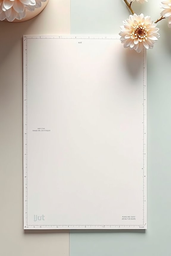
When you’re designing a gift card that’ll look polished in someone’s wallet, understanding bleed and safe zones becomes your strategic advantage against printing mishaps. You’ll want to extend your artwork 0.125 inches—about 3 millimeters—beyond your trim size on all sides, creating what designers call bleed. This buffer protects against mechanical cutting variations that naturally occur during production. Meanwhile, your safe zone keeps critical content, like logos or text, positioned at least 0.2 inches inward from the trim boundary. Think of it this way: bleed gives you creative freedom at the edges, while your safe zone preserves what matters most. Together, they’re your insurance policy for results that’ll make every recipient feel valued.
Edge-to-Edge Artwork: Maximizing Visual Impact
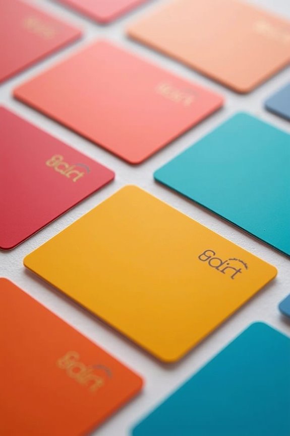
You’ll elevate your gift card’s visual presence by extending your design to all edges—a technique that maximizes the impact of a standard rectangle. Through strategic shading and gradients, you can craft a subtle raised-edge illusion without physical embossing, making your card feel more luxurious than its flat surface actually is. By framing your imagery thoughtfully or letting it bleed to the borders, you’re filling space with intention and maintaining legibility across textures while keeping critical text and logos safely nestled 0.2 inches inward.
Design Extends To Edges
To captivate someone holding your gift card, abandon the timid margins and embrace the full 3.375 x 2.125 inch canvas available to you—because half-hearted design wastes precious real estate. When you push imagery to the edges without restraint, you’re creating something memorable that commands attention.
Plan strategically though. Account for a 3 mm bleed extending beyond your card’s trim line, plus a 5 mm safe zone where critical content stays protected from cutting mishaps. This technical precision keeps your bold colors and branded imagery intact—no accidental cropping of logos or messaging.
The result? A polished, professional appearance that elevates an ordinary card into a statement piece. Your design becomes worth remembering.
Shading Creates Raised Illusion
Your edge-to-edge design is bold, saturated, commanding—but here’s where it gets sophisticated: strategic shading converts that flat surface into something that feels three-dimensional, nearly embossed, inviting the recipient’s fingers to trace an edge that doesn’t actually exist.
You’re utilizing visual depth through gradient shadows and highlight placement along borders. Darker tones near the perimeter add dimension; lighter accents suggest lift. This technique works well with rounded corners, which soften transitions and amplify the raised-edge effect without requiring embossing costs.
Your full-bleed design maintains this illusion across the entire card surface—no white margins breaking the effect. The edge shading anchors the composition, making your brand colors stand out while establishing a premium tactile experience that feels deliberate, refined, and distinctly yours.
Frame Integration Strategies Matter
When you’re designing edge-to-edge artwork for a standard 3.375″ × 2.125″ gift card, the real sophistication lies not in filling every millimeter, but in knowing which elements need breathing room—and which ones can extend right to the margins.
You’ll want to coordinate your frame geometry with the card’s margins, so the frame feels intentional rather than arbitrary. Consider a wrap-around design that reinforces framing cues—your front artwork flowing smoothly onto the back creates visual continuity and professional polish.
Place critical details—logos, recipient names, essential text—safely within inner zones. Let background elements, textures, and color gradients reach the edges, creating that sophisticated frame effect. This strategic layering gives your card distinction and refinement, delivering the quality your audience values.
Bold Layouts That Grab Attention
How can you make a gift card impossible to ignore?
You’ll want to embrace edge-to-edge designs that command attention the moment someone spots your card. Bold imagery should dominate the space—not whisper from a corner, but claim the entire visual landscape with confidence and color contrast that signals quality.
Consider these strategies:
- Extend your strongest visuals from edge to edge, creating an immersive experience
- Layer brand elements prominently—your logo, signature colors, distinctive typography
- Apply edge shading or raised-edge illusions that suggest depth and sophistication
- Develop wrap-around concepts connecting front to back for extended storytelling
This approach converts your gift card from forgettable rectangle into a design statement. You’re not just offering value; you’re offering an aesthetic experience that reflects your brand’s personality and demonstrates respect for recipients.
Custom Shapes: Standing Out From Standard Cards
You can transform your gift card from a forgettable rectangle into a memorable brand ambassador by choosing a silhouette that echoes your business—think a coffee cup for your café, a pint glass for your brewery, or a shopping bag for your boutique. When you align the card’s shape with your actual product, you’re not just creating a physical object; you’re crafting a tangible extension of your brand identity that recipients won’t discard. This strategic choice, paired with edge-to-edge artwork that wraps around your custom contours, demonstrates sophistication and deliberate planning—communicating to customers that you’ve considered every detail of their experience.
Brand Identity Through Shape
Why settle for the rectangular conformity that fills every wallet in America when your brand deserves a silhouette as distinctive as its story?
Your custom shape isn’t merely decorative—it’s a strategic declaration of brand identity. When you align your card’s form with your core offering, you create immediate recognition that transcends the standard 3.375 x 2.125 inch rectangle. Consider these shape possibilities:
- A coffee cup silhouette for your specialty café
- A pint glass outline for your craft brewery
- A chef’s knife profile for your culinary brand
- A paintbrush shape for your creative studio
Non-rectangular shapes demand attention in wallets, though they require special envelopes and increased printing costs. Cut corners offer a compelling middle ground—adding creativity while preserving wallet permeability and card efficiency. Your shape choice should echo your brand’s essence, remaining instantly recognizable across all marketing materials.
Memorable Design Differentiation
The wallet test reveals everything—when your gift card sits beside a dozen competitors, shape becomes your silent ambassador. You’re not just handing over purchasing power; you’re crafting an experience that lingers in someone’s pocket.
| Shape Strategy | Impact |
|---|---|
| Coffee cup silhouette | Brand recall increases |
| Pint glass outline | Memorable differentiation |
| Standard rectangle | Practical, forgettable |
| Custom contours | Premium perception |
| Rounded corners only | Subtle distinction |
Your memorable design differentiation doesn’t require radical departures from standard vs custom sizes. A pint-shaped card for a brewery gift, a coffee cup for artisan roasters—these choices whisper belonging to your community. Yet you’ll balance this aspiration carefully: custom shapes demand precision printing, envelope adjustments, wallet compatibility considerations. The payoff? Recipients remember you. They don’t lose your card among rectangles. Your gift card design shifts from transaction into keepsake, becoming the shape they reach for first.
Premium Finishes That Signal Quality
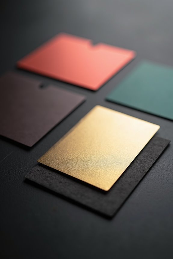
Ever notice how a luxury hotel key card feels different the moment it touches your hand? That’s tactile luxury—and you can create it with your gift cards.
Premium finishes signal quality instantly. Consider these elevation strategies:
- Foil stamping with custom metal dies — transforms your logo into shimmering accents that catch light and command attention
- Glossy coatings — deliver high-shine surfaces that strengthen first impressions and amplify color vibrancy
- Matte or uncoated options — convey sophistication through understated elegance that emphasizes your branding
- Edge effects through design — simulate raised-edge illusory shading, implying tactile luxury without dimension changes
Production terms like 4/0 and 4/4 determine color application consistency across all sides. You’re not just printing cards—you’re crafting tangible expressions of value that recipients won’t dismiss carelessly. Your brand deserves finishes that feel as premium as the experience you’re offering.
Matching Your Card to Standard Envelopes

How you present your gift card matters just as much as what’s printed on it—and that starts with choosing an envelope that fits properly. Your standard 3.375-by-2.125-inch gift card dimensions require careful envelope fit planning. Common 4×6 and 4.5×6.25-inch envelopes work well for everyday gifting, while premium 5×7 options suit larger cards featuring robust branding. When designing edge-to-edge artwork, you’ll want to incorporate a 0.125-inch bleed margin—this allows your full-bleed printing to reach every corner after trimming, avoiding awkward white edges. Match your card’s dimensions precisely to your envelope’s inner measurements; too-tight fits risk damage during mailing, while excessive movement creates a careless impression. You’re creating an experience that conveys sophistication before the recipient even opens it.
Brand Identity Through Color and Design
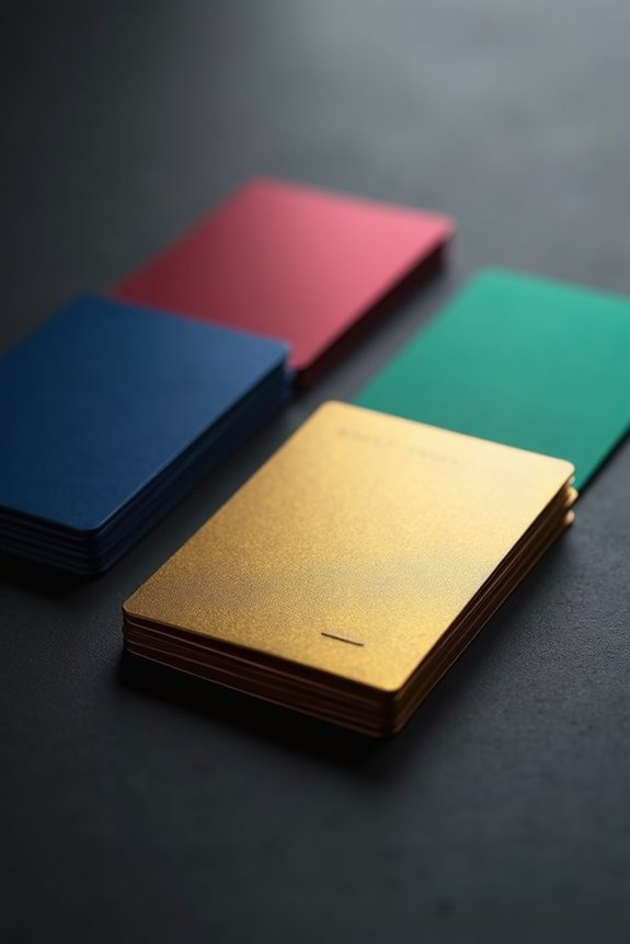
When your gift card lands in someone’s wallet alongside a dozen others, you’ve got seconds to make an impression—and that’s where color and design become your silent ambassadors.
Your brand colors form the foundation of recognition. Choose bold, consistent hues that mirror your marketing materials—think Tiffany’s signature blue or Starbucks’ forest green. Your logo deserves prominence on both sides, reinforcing who you are right away.
Consider these design elements:
- Edge-to-edge artwork featuring your recurring brand motif
- Strategic logo placement at card center or corner
- Color finishes—foil, gloss, or uncoated—matching your brand personality
- Wrap-around patterns that strengthen visual branding continuity
Your visual branding converts a simple card into a memorable brand experience. When someone reaches for that gift card, they’ll recognize you immediately—that’s the power of deliberate design.
Wrap-Around Design Strategies for Engagement
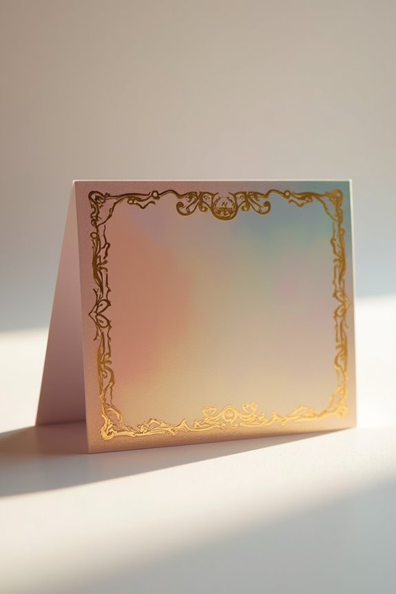
Why settle for a gift card that stops at the edge when you can create one that invites recipients to turn it over, explore it, examine it from every angle? Wrap-around designs build a cohesive experience—one that flows from front to back, drawing recipients into your brand’s narrative. You’ll extend key visual elements across the spine wrap, creating visual continuity that feels deliberate and refined. Edge-to-edge artwork maximizes this effect, eliminating dead space and encouraging exploration. Consider bold, motif-driven borders—perhaps a playful puppy tail or interlocking puzzle pieces—that unite both surfaces while reinforcing your brand story. This strategy doesn’t just catch eyes; it creates a moment of genuine connection, turning a transaction into a notable touchpoint that values your relationship with recipients.
Regional Production Standards You Need to Know

Where your gift card gets produced matters far more than you’d think—because regional standards aren’t just bureaucratic checkboxes; they’re the invisible architecture that determines whether your card functions as a premium keepsake or a hastily assembled afterthought.
Regional standards transform gift cards from hastily assembled afterthoughts into intentional, premium keepsakes that reflect your brand’s sophistication.
You’re joining a community of creators who understand that dimensions, finishes, and production specifications aren’t constraints; they’re creative foundations. Here’s what shapes your regional production standards:
- Standard dimensions of 3.375 x 2.125 inches aligned with credit-card proportions
- Bleed extensions requiring 0.125-inch margins beyond trim lines
- Corner treatments—rounded for portability, sharp for bold branding
- Finish options including foil stamping, gloss, or uncoated textures
These gift cards reflect your brand’s sophistication. When you honor regional standards, you’re communicating that every detail—from thickness to trim—matters intentionally.
Testing Mockups Before Your Full Production Run
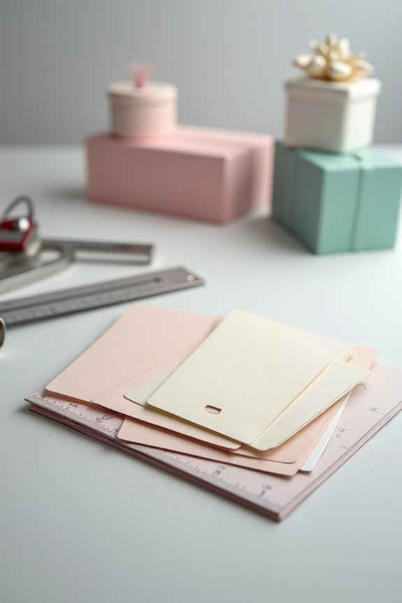
You’ve mapped out your regional specifications—the 3.375 x 2.125 inch dimensions, the bleed extensions, the finish treatments—and now comes the moment that separates thoughtful creators from those who cross their fingers at the print shop: testing mockups before committing to your full production run.
Create duplicate front and back designs on a single layout, confirming proper alignment. Test your standard bleed at 0.125 inches with a 0.2 inch safe margin for critical content like logos and text. Produce physical prototypes alongside digital mockups in common formats—4×6 and 5×7 inches—to verify color accuracy and branding consistency across media.
Run actual print samples. Assess edge trimming quality and how raised-edge effects render. This scrutiny builds confidence, protecting your brand’s reputation and your investment.